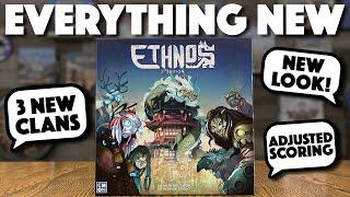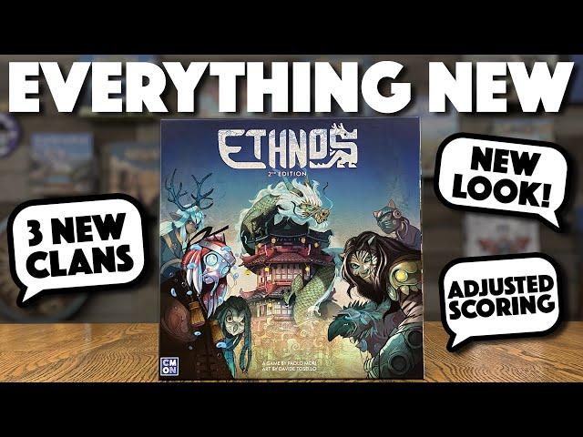
ETHNOS 2nd Edition - What You Need to Know!
Комментарии:

"Adjusted Scroring" huh?
Sorry, someone had to notice AND make a comment... 🤣

Oh, I see that Dune Imperium Bloodlines behind you!!!
Ответить
Personal taste - the art is awful
Ответить
I prefer the old art.
Ответить
Replace John Howe with an art style akin to a mobile game. Genius!
Ответить
Dang it, I was excited for this but had no idea they made it Anthropomorphic which I hate. I hate the star map. And hate the cartoon look of the "races" they could of pulled from countless mythos but had to make up silly animal people. Vikings,Egyptian, Chinese, Japanese, Aztec, the applacaticia mts mythos. Sci-fi, or Cuthulu even would of been cooler. Pitch meeting: we need raccoons, and opossums.
Ответить
I like the new art much more. I like old school fantasy art. But the first edition only had cool art for the box. Is really awesome. But the game it self was meiocre at best. The new one is pretty cool. Like you said is a cartoon that I would love to watch. Not the best mind you. There are many games with best cartoonish art. But its good. I will get one second edition for me for sure
Ответить
Stoked , definitely jumping on this , thanks for the video
Ответить
Two steps forward , two steps back
Ответить
for people who have a problem with anthropomorphic animals, that's okay. i feel the exact same everytime i see another dark fantasy themed bg. i play games with my family and anthropomorphic animals are more fun, just like kungfu panda & ninja turtles are fun. the next time i want to hang out with a bunch of nerds, i'd let them pick a dark fantasy theme.
Ответить
I like the new art!
Ответить
I've been shouting this on the roof tops for years. So glad to see that they have seen the light. lol
Ответить
To each their owN when it comes to art. For a first time player, the fact that this has 13 clans and a solo mode gets me excited to play it 🤩
Ответить
This art doesn't do it for me.
Ответить
1st edition had text on the cards, which makes it better by default. One positive I'll say about this new edition is it will be more appealing for a younger crowd ...
Ответить
Idk. Everyone always put down the art on the original but man all those people were wrong. Art on the old edition is way better. The new art is just tooo modern or maybe to ai if i may say that. Meeeh...we see it all the time..this new vibrant art...its really not that great. And the board too with that gredient shaded water...its a meh. Thr art on the ild is just unique. This new art style is just seen everywhere these days. Im glad i didnt sell my old edition.
Ответить
I need a solo playthrough. I still cant seem to understand how the solo mode works.
Ответить
I'm kinda annoyed that I settled for Archeos Society when I could have just waited for this!
Ответить
Nice! Looks interesting for sure.
Ответить
I am so glad Ethnos got a 2nd edition for everyone to enjoy. The old one had amazing art with a bland board and almost posphorescent pieces, this one looks more coherent and overall great (even though I do like the old art A LOT better though). I like the terrain banner of the new card design, it is a big improvement along the new map, but I am not sold on the different look of cards on the same clan. Even though I appreciate the effort I believe mechanically it makes something that should be easy to read a little more clumsy. Instead of a small icon in different shades I would have gone with just the same art, even though less flashy it's probably more readable from anywhere on the table. Function over form.
Ответить
So excited! I wonder if the cards are ok for colorblind players? I love animals, not so jazzed about Asian-themed animals.
Thanks for the heads up.

Promos only at conventions? Immediately not interrested anymore….
Ответить
What’s the msrp?
Ответить
None of the changes in this new version are appealing to me, especially the art and graphic design. Even the map and tokens seem unnecessarily busy and more difficult to tell height and placement. Happily keeping my 1st edition.
Ответить
Agree with @Sir_I.L_Wilson. I think that replacing text with icons is a huge mistake. Having the written description is one of the things that make the game easier to teach and play and it helps keep the flow of the game moving. This game can be so quick and snappy with your turn popping up in a flash. To have players having to look up or mentally transcribe the faction abilities will disrupt that flow. I don't need more factions, but I do see myself adapting the scoring tokens with the new amounts.
Ответить
The 2nd edition needs a 2nd edition.
The new card design is a miss. I don't mind the artwork, but the clan members aren't coherent and can't be distinguished quickly when a lot of cards are out. Every clan member having different colors is confusing. Maybe if their clothing more closely matched the color of the clan icon? More like a uniform for each clan.
Normally I love when every card has unique artwork this looks cluttered.
Also not a fan of switching completely to iconography. Of course you will memorize it after enough plays but with so many factions it will take a while. Makes it harder to teach too.

My biggest gripe is lack of card text, in favor of symbols. I get why it's done, but I still hate it. Also I wonder what the availability of the promo content will be after a certain window of time.
Ответить
I’m excited to add to our collection finally!
Ответить
This is a great comparison. Thank you! I’ve been very curious about the new additions. I like the point adjustments for the area control. I hope they support this more with even more tribes!
You’d think with such divisive art in the first one, they’d go with something other than anthropomorphic animals. It looks like they borrowed the look from the new Libertalia. Which I wasn’t really a fan of, but I’m still looking forward to this 2nd edition for the additional gameplay.

My only objection to the art on the earlier version is that some people REALLY didn't like it, and that was literally the reason those same people refused to try it. I prefer the new art, but even if it isn't your thing, it's easy enough to ignore, unlike the original art, which made a super-fun, engaging, quick to learn rummy game look like an old school miniatures game or dungeon crawl.
Ответить
How much input did the designer have in the changes to the second edition or were they just imposed by the publisher? That seems important if there is new scoring, new factions and a new solo mode. Thanks for the overview!
Ответить
New dont allways means better.
Ответить
A new example of brilliant, but very generic art.
Ответить
I love the new art but never played the original. I would love to see a play thru. Interested !
Ответить
I think they are making this purely because people didn’t like archeos society. But strangely.. I prefer the old art.. I wish they just didn’t same game with better art. Not weird whimsical art.
Ответить
Thank you for the heads up!! Would you happen to know when it's going to release? I don't wan to miss the promo clans 😭
Ответить
I think archeos society had a great theme for this and decent art, and if they had made that area control like this one, it woulda been a great balance.
Ответить
Stop making every game Anthropomorphic animals, it's lame
Ответить
Would every copy of the first print include the promo clans? do you guys know?
Ответить
Sugoooooi!!! 🔥🔥🔥
Ответить
Archeos Society just sucked, and after it was realized Ethnos 2 was pushed out.
Ответить
Promos are lame! Why have 4 promos? That's 1/4 of all the clans, which adds up to an expansion. Unreal how these companies actually want promos to be overvalued, and those who actually support he company by owning the game to suffer by not having them, or paying $50 for a promo to have it, which happened with the Fairies in the first edition.
Ответить