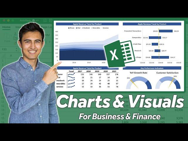
AWESOME Excel Charts & Visuals | For Business & Finance Professionals
Комментарии:

The gauge chart is my favorite. ❤🎉
Ответить
anyone else experience the data label not moving accurately with the ticker in the guage chart? what is the solution to this?
Ответить
How would you set up a formula to make sure it is between 0 and 100?
Ответить
Coooool!
Ответить
Kenji you are too good
Ответить
Love that gauge chart, well done Kenji!
Ответить
Thanks!
Ответить
Great video
Ответить
Hi was trying to set stick but cant i have done same to same but did not set like you was done
Ответить
Kenji is the hero on concepts and all about ecommerce and excel!
Ответить
Brilliant, and very easy to follow, thank you :)
Ответить
This is the type of content that should have 500 M clicks!
Thanks so much for giving us this information basically for free!
Greetings from Austria

BS
Ответить
Kenji likes doughnuts 😄
Ответить
Hi bro I'm from WEST BENGAL .How are you doing today..
Ответить
Plz Suggest some FINANCIAL & Marketing Data Analysis Portfolio Projects for Absolute FRESHER on - Data Cleaning , EDA , DASHBOARD Visualisation
Ответить
Can someone please help me - I dont get when he means Alt+W+VG do I press all of these at the same time? Also I have a mac
Ответить
Instead of putting a line shape to represent the price today, perhaps turn this into a combo chart and put an extra column for all categories named today's price. Then turn that column alone into a column chart and increase the gap width?
Ответить
Fine Kenji, Excellent Explanation🤠
Ответить
Excellent. Informative. Thank you
Ответить
If you want to say the shortcuts for things, that's fine. But if your goal is to teach, you should state where the menu option actually is instead of just saying AltWVHTKDH like we're already fluent.
Ответить
Hvala!
Ответить
You making me love the blue and white color theme
Ответить
How did you master shortcuts?
Ответить
Your color choice is different, it look so professional
Ответить
This guy is the hotkey king
Ответить
This channel is a goldmine
Ответить
Kenji... can we use a negative variable in a Gauge Graph?
I can't seem to do it.

Super awesome
Ответить
I learned so much from this video. Thank you so much for sharing!
Ответить
great work sir please make video of macro
Ответить
Awesome 👍
Ответить
i used to think that excel built in graphs and charts are poor, now i realized how much you can actually do with them
Ответить
excellent
Ответить
Thanks Kenji. Your tutorials r super.. Very educative
Ответить
Kenji, my man!! Your videos are awesome 👏 just finished the first year of my MBA and currently interning at VC firm and your videos have been a tremendous help, thank you!
Ответить
You have the most advanced and on-point excel tutorial. Learning heaps from you
Ответить
Great smooth explanations very satisfying to watch the tutorials.
I learned many useful things from your videos thanks for your great help 👍
I would like to know about the software you use to record and editing these amazing learning videos.
Thanks again 😊

I'm loving the excel video. Can I text you on Linkedin? I need to ask you something.
Ответить
That trend line column was really cool. I will use it a lot now for each row. Thanks a lot for such an informative lesson.
Ответить
Thank you, outstanding! Best regard from Limón, Costa Rica!
Ответить
Great skills of explanation. Good luck 👍
Ответить
Great work as always brother!
Ответить
Hey Kenji, thanks for the amazing content.
Quick question: when setting the print area (alt +prs)--how do you create a toggle with If() that would allow the colors of the print area to change to black/white?

We should be able to get some sort of University credits by watching your videos haha, really appreciate your commitment towards helping the public 🤝🏽😁
Ответить
i'm not sure about that colorful graph in the beginning...i've never seen a graph like that before...wouldn't the data be better in a line graph?
Ответить
Dahell. You make it look soo easy. I never hsed charts in excel and I have been failry comfortable with excel and modelling too.
This is lovely content!

Wow! You will rock brother. Keep posting videos.
Ответить


