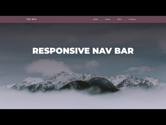
Responsive Navigation Bar Tutorial | HTML CSS JAVASCRIPT
Комментарии:

👍🙏tnx a lot
Ответить
Thanks a lot😊
Ответить
Great tutorial
But there’s one css property that you used wch make it so confusing
(nav.action) pls where did you specify this in you html?
I didn’t get that alone

Thank you
Ответить
any document for source code
Ответить
Man the code is having issues on small devices please run through
Ответить
I watched this video 6 months ago when I started studying web development, and I couldn't understand anything past the CSS part of the video. I watched it again today and could understand everything, I'm still not a junior level though, but I'll keep pushing myself on until I get there. Thanks
Ответить
You deserve a like for that Ed! :) Many thanks!
Ответить
your a great teacher bro
Ответить
for some reason my hamburger will not click or open the mobile menu and the text is still in the middle of my header any help would be appreciated.
Ответить
Men you deserve a sub.
Ответить
Very very nice tutorial
Ответить
Oh I see you have some pervy HOTEL PICS in that folder of yours eh?
( ͡° ͜ʖ ͡°)

dude you've got such a vibe, which i loved it, thank you so much!!
Ответить
Thank you for this great tutorial
Ответить
thank you so much
Ответить
I did it exactly the way he showed in the video but the mobile menu doesn't close when clicking a link. How can I fix this?
Ответить
Can you do all this on notepad? Do you have to use this software? Is there a way? I know its probably longer but just wondering
Ответить
Hello :) I am beginner in Webdeveloppement and I love this video. Thanks for that! But I have a little question for the animation from the burger to the cross at the end of the video. You rotate line1 and line3 for 45deg and after that you make a translate. I understand the principe but how do you calculate the values for the translate (5px and 6px)?
Ответить
I learned A LOT! Wow what a great tutorial. I subscribed. Thank you. Looking forward to watching more from you!
Ответить
i have a mobile i want a laptop but no money 😩
My Dark Future 😔

nice tutorial!
Ответить
this is our code now ;)
Ответить
That's what she said xd
Ответить
super
Ответить
This was fantastic
Ответить
The way it was going well till javascript 😭😭😭 so exhausted of doing it for two days whenever i hover over the menu after setting the function it doesn’t display
Ответить
I'm a bit late to the party... Nice video and ready to follow along. I'm just getting started with web dev and would be great if you could lay out the vsCode plugins you use... Some of those make it really easy to read and type
Ответить
Can you upload the source code please. Its pretty useful to those making a mistake midway....
Ответить
I just skip back to read what you write and the script is so hard to me hahhh.. the last script did not work on my browser
Ответить
Hi! I need your help. I followed your tutorial and managed to do it. however, when I uploaded the site to host the site, when I open it on my cell phone, the burger links menu is generating a side scroll bar, with the menu created in the burger. how can i fix this?
Ответить
Very helpful. Thank you very much
Ответить
ive done everything right it just wont go from mobile to desktop without me clicking the burger, so somthing is wrong somwhere, someone please help everything is working accept that one feature.
Ответить
paddding... drove me nuts. I appreciated watching the thought process. The mistakes helped in seeing how to troubleshoot. I know this is an old video, but along these lines, the huge gap between the mobile menu items, what can you do to lessen that? Thank you for this.
Ответить
I've followed the Ideas of your Video. I still have the problem that I can scroll horizontally on my Smartphone.
I included the overflow-x: hidden; property. But I can still scroll horizontally.
What can I do?
Can it be that the Problem is, that I set the width of my pop-out menu to 100% instead of 50%?

Hi thank you for your video but how did you get the image of the drop down menu, the image of the black three lines logo,thank you
Ответить
thank you for your video. But I have a question about "nab-active" where it comes from?
Ответить
There is one problem with this navibation bar. In the mobile view, when the user click on the link, the navigation bar does not close as it should be.
Ответить
hey man i got lost at the '.nav-active' where exactly in the html file is this class supposed to be, great vid by the way
Ответить
my device can't recognize @keyframes. Can someone help me please?
Ответить
You are awesome thank you
Ответить
Am I the only one who got an issue showing the links in mobile mode? I couldn't make them visible and I litterally followed anythong he did...
Ответить
you jump all over the place, it was really hard to code alongside you, and it was even harder to find what I coded wrong as the code become bigger, It would be much easier if you add the files to the description as well, would be much more useful than your pc spec information. Anyway, after @media code nothing worked for me and I am pretty sure I did something wrong, but cannot check.. so thanks it was useful till that point.
Ответить
Please,Slightly zoom it .it will be comfortable to see your videos in mobile phone
Ответить





![[#줄서는식당2] 햇님 혼자서 막창 8인분에 볶음밥 2인분까지 먹어줬습니다... 대식가 보고 현실 리액션 폭발한 사장님ㅋㅋ [#줄서는식당2] 햇님 혼자서 막창 8인분에 볶음밥 2인분까지 먹어줬습니다... 대식가 보고 현실 리액션 폭발한 사장님ㅋㅋ](https://rtube.cc/img/upload/RUZXUjYyQ0hMWDg.jpg)
