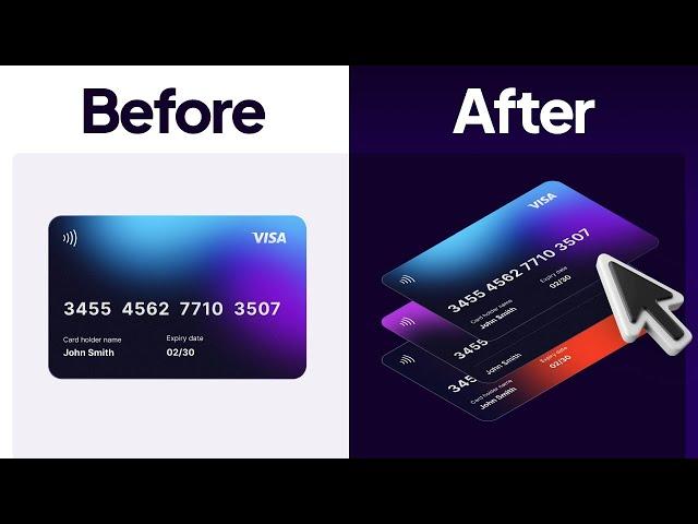
Figma Tutorial: 3D Isometric Animation in 6 Minutes
Комментарии:

❤❤❤❤
Ответить
تنکیو داداش
Ответить
Can I borrow the design file ?
Ответить
Awesome
Ответить
I learn a lot from your videos, so clear and without verbiage....
Ответить
Hey Arash could be silly of me but what is the reason of using the blank frame behind the card and not just linking the cards via prototype.
Is there are certain thinking/reasoning behind it using the frame to set the animations.

So how would you get that on an actual site?
Ответить
Your voice is amazing 🙈
Ответить
Well done 👌
Ответить
Please make a tut on Start to End step by step whole UI UX project journey
Ответить
Very creative. Could you please share your LinkedIn handle? I'll design this and would love to tag you.
Ответить
Awesome
Ответить
Love your content Arash. If you can make a video on how to follow popular Design System for work , it would be great ♥.
Ответить
Could you please share those credit card png's please! I couldn't find good stylized images, so using these same ones would help, thank you!
Ответить
Thank you very much!❤
Ответить
I am Persian and I am studying UX in Sweden and I have to tell you how much your videos is good for me🙏
Ответить
Could you please make a dashboard design video
Ответить
i am Aliyu and am a studying ux design and i have to tell you how much your videos mean to me thanks
Ответить
Sorry please, the fast isometric plugin isn't showing the transform option for me
Ответить
Amazing
Ответить
Great!
Ответить
Awesome! Thanks for making things so clear and to-the-point ✌️Q: If you had more cards, and the they had to fly in from both sides and with different pace, would you still use “After delay” and one Default Frame?
Ответить
❤❤❤❤❤
Ответить


