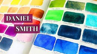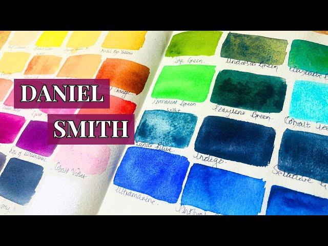
What I use & why - My Daniel Smith watercolours
Комментарии:

I don't even understand why DS Cobalt Violet exists! I thought the same thing when I first had it like maybe I had received a bad tube! I think it came in one of the small curated sets, but not sure.
It was also funny hearing you talk about the 2 Mayan blues! I did exactly the same thing! I first bought the Mayan (not dark) one, thinking it was the only one, so I pickedm the larger tube. Then, when I realized there was also a Mayan Blue Dark, I had no choice about the size since it only came in the 15ml tube. Ended up spending like $35 on just those 2 tubes of paint! Ugh.
I love all of Daniel Smith's greens!

LOVE IT! Daniel Smith Junkie, I too am a huge sucker for granulation, I would add Piemontite Genuine, Hematite Genuine & Hematite Violet..Thanks for the entertaining video Sketches, Cheers from Canada
Ответить
I love splashing in Cobalt Blue Turquoise into Moonglow I adore Quinacridone Deep Gold...it's part of my essentials palette. Helio Turquoise is gorgeous as well.
Ответить
Quinacquadone burnt scarlet & rose of ultramarine are 2 of my fav D Smith paints. Looking at up the colors you have I think you would LOVE Rose if Ultramine. Thank you for sharing your colors 🙏
Ответить
Hi stranger! Love your videos! May I ask what equipment you need to do YT videos?
Ответить
Have you tried the cobalt violet dried down in a pan?
It might help

I love Daniel Smith’s Aussie Red Gold, Imperial Purple and Jadeite Genuine
Ответить
cascade green is my absolute fave!!! it looks so different diluted
Ответить
I noticed you only have one red in your Daniel Smith Collection.
Ответить
Lovely colors! DS has become my favorite brand. One beautiful color I didn't see that you have that I use all the time is phthalo turquoise. It's a series 1 and beautiful!
Ответить
Enjoyed this ❤ thank you
Ответить
If you can collect watercolors slowly, you can collect them quickly. 🙈 Love that you started with my favor buff titanium ❤
Woah, that cobalt violet is BAD. Woah, that’s a nice, thick silver… I want it! 😂

I love buff titanium for skin tones and florals . Especially when you want to make peaches and blushes. Great idea about having half pans ready . I have all ds blues and greens. I just started buying the winsor newtons because I bought the abstract watercolor book and her work is so bold and bright. She has some blues I never seen .I agree about warm yellows . I love Quin gold soooo much . I always have 15 ml in burnt Siena, burnt umbers, Payne gray, Quin rose, quin magenta , ultramarine blue ,phthalo blue ,( basically warm and cool )
If you use lunar black you can make everything granulated. There is video that shows you how . I thought black would overpower the lighter colors but it doesn’t. Yes cobalt violet I bought twice thinking I was scammed because I bought 1 st one off amazon and not off art store . Then I Tried to get the qor version but it’s been out of stock . You are spot on about everything you said about all your colors . So glad I found you !!!

You should get some of the Amethyst, you will be surprised by the gorgeous sparkle as well as just how dark it can get. It is a stunning colour.
Transparent Red Oxide is a lovely brown too by Daniel Smith.

If you want a pinky-purple shade, try Wisteria, I also like VanDyke Brown, it's great for dark tree bark.
Ответить
It definitely looks like there is something wrong with that Cobalt Violet. I have a tube and just swatched that color recently. The tinting strength is low, but not that low! It’s actually one of my favorite colors for floral painting - it’s a lovely, delicate color with nice granulation. Maybe your paint has separated in the tube, and stirring it with a paper clip would help?
Ответить
: = colon
Ответить
Mmmm lovely! Funnily enough, I'd been thinking of swatching just my Daniel Smiths too!!
Ответить
When the paint comes at me I usually pinch the sides of the tube to create more volume, sucks the paint back in
Ответить
Cobalt violet would be good for the super delicate pink of dawn landscapes
Ответить
Rose of ultramarine is at its best with more water, I think. It’s my favourite!
Ответить
About the Burnt Sienna: an excellent substitute - besides the Quin. Burnt Orange that you already have, is Transparent Red Oxide. It has a little more punch of both brown AND red to it, and is likely the color sienna that you are longing for. And also, FYI - you can make excellent greys with BOTH your Quin. Burnt Orange OR the new Transparent Red Oxide as long as you have some Cerulean Blue, Chromium in the set; that blue will work with those 2 siennas the same way that Burnt sienna & [French] Ultramarine Blue do. So there ya go!
Ответить
About the Amethyst Primatek watercolor versus the Quin. Purple you already have: NO - you do NOT need to bother with the amethyst unless you want a darker, more dirty and earthy amethyst effect. I have watched a LOT of color swatching & color comparisons made between similar colors (as part of my own personal research, to determine which paints I should spend money on, as "must have" colors), and the primatek line doesn't match the vibrancy or color payoff as most of the Quinacridones, for the most part. There are a few of them that would be worth the money, IMO, but a lot of them you could get the same or close enough color effect with one of their less expensive series of colors, tbh. The clear, vivid purple of an Amethyst crystal is not what you get in the paint, since it is a "ground up & powdered" version of THE WHOLE CRYSTAL - which includes some clear quartz aspects, and darker striations of other minerals that basically 'contaminates' the pure purple hue of the larger and prettier amethyst aspects, when it's all ground up together to make the paint.
Ответить
I bought the DS Jean Haines collection of iridescent colors & the Electric Blue is stunning! I believe it’s cerulean blue with mica. Probably my favorite is the Cobalt Teal but I don’t have that one yet.
Ответить
I enjoyed this video very much. I found it very helpful and informative.
Ответить
I will explain some of the paint colours that you had questions about. There is nothing wrong with your Cobalt Violet it is the colour of the paint. I use Cobalt's paint for the granulation when added to other paints. I like Rose of Ultramarine paint as well. This paint is easy to mix with Ultramarine and Q. Rose. I prefer a Neutral Tint for a non-blue grey than Paynes Grey. I have found the cheapest way to replace Daniel Smith paints to use their sets. Most of the colours you want to replace can be found in the Jean Haines D.S. set. The blue colours come in a set in half pans. The bonus in the blue set is the most expensive paint Sleeping Beauty Genuine. I hope this information was helpful.
Ответить
I recommend 1. Benzimidazolone Orange PO36, it is an orange with a touch of earthiness, not overly bright like Pyrrol Orange. 2. Geranium Red PR242, a bright scarlet that shift towards pink in tint. Both look quite similar in masstone, but have different undertone and mix differently.
Ответить
Watching these reviews you always find some new color you are amazed of, it's always intriguing. To me, in particular the purples are a nice base for many floral layouts as well as the yellows, but it's fair to say it's beautiful overall. Thank you for review, pretty hair lady 😊😊
Ответить
Some additional reds for a well rounded palette.
Ответить
Omg I need that mayan blue 💙 I think you might enjoy serpentine genuine. I used to hate greens until I tried it 🥰
Ответить
This is so good, you have a gorgeous palette ☺☺
Ответить
Green gold and burnt umber
Ответить
Unfortunately the paints I’m really enjoying at the moment are the ones who ghosted you. So I won’t recommend them.
I only have four DS paints but I’m sure I’ll get more the next time a good sale comes around. Even so, it’ll be pricey. Lovely video, thanks for sharing your collection ❤

I would suggest Serpentine Green for its granulation and Carbazole Violet because it's such a deep royal purple that's great for shadows. I have Indanthrone and wish I had gotten indigo instead. A surprise color that I love is Nickle Titanate Yellow because it makes soft buttery yellows that feel almost dreamy for florals, and the smidgen of opaqueness softens mixes.
Ответить
Cobalt violet is one of my favorites, but Daniel Smith doesn’t do that one well. Winsor Newton and Rembrandt have better versions, and DaVinci’s cobalt violet deep is GORGEOUS.
Ответить
Love your videos! You have a number of my favorites in your palette. For a granulating brown I am enjoying Mummy Bauxite, Piemontite Genuine & Burnt Tigers eye. For a granulating green/black I really like Black Tourmaline. Blue Apetite genuine is another favorite.
Ответить
Your greens will never be complete until you get Serpentine Genuine from DS! Indanthrone Blue is my go-to dark blue, also DS. I would like to say that something looks very off with your Burnt Sienna! My DS Burnt Sienna is much more pigmented. Contact DS customer service and they will confirm if the batch number is off, and they will replace it for you.
Ответить
I believe Lavender, not Amethyst, is the color Sarah Burns raves about for landscape. When she took that Ian Stewart (?) workshop he put a little bit on everyone's pallet for them to try it, perfect for those distant hills! It's on my list! Another one to try for an earthy granulating warm brown is DS bronzite, check it out!
Ответить
The two dots in PB15:3 are called PB15 colon 3. 😉
Ответить
Your presence is delightful!
Ответить
Amethyst genuine. Yum
Ответить
I do love Indanthrone Blue, and Amethyst (subtle sparkle!). Like you, I have Shadow Violet and Moonglow, and Moonglow is my favorite of the two. Lavender is great for mixing and on its own, and I also have fun with some of the Duochrome colors (love Duochrome Autumn). I use several of them for my painted gift tags for last Christmas. Like you, I also have to have a Sap Green in my palette and a Payne's Grey. And I like Sleeping Beauty...maybe because I'm all about fairy tales. :)
Ответить
Thanks for the video! Great to see your Daniel Smith faves. My can’t do without Daniel smith colour is green gold - a beautiful natural spring green, which has nickel azo yellow in it. Also really like their Lunar blue and Cascade green. Also like lavender and Imperial Purple, which is same pigments as rose of ultramarine, but is more of a royal purple. Instead of burnt sienna I use their transparent red oxide, a bright reddish brown which mixes lovely greys, but is very granulating. Edit: manganese blue hue is a similar value to cobalt teal, but it’s defo bluer leaning. I use it for skys, as it’s a bright cool blue which can granulate a bit.
Ответить
I love watching what artists palettes look like 😊. Thank you for sharing . I love all your choices they all are so beautiful .
Ответить
Have you tried stirring up the cobalt violet it looks gummy like it just needs to be stirred really well. My van dyke brown from mission gold is constantly that way if I just pour it out of the tube and don't sit well then I can't get it hardly any color at all. So frustrating, but it might be worth trying to see if it works. The trial of dealing with tubes!😂
Ответить
I love Amethyst and Quin Sienna. Quin Sienna is great for landscapes and it has pizazza
Ответить
Daniel Smith is my hometown hero - starting marking his art materials out of his garage on Nickerson St.. The main DS store was Nirvana. I miss the classes, the demos and all the art resources in the store. We were spoiled. Since I retired I have started collecting his watercolors. A joyful treasure trove - just looking at all the many colors - Bliss! When I was in college I thought spending $1.50 on a small tube of Cotman or Grumbacher was over the top but necessary. A very good sheet of watercolor paper cost three whole dollars. So I bought the dollar sheets and cut them into smaller sizes. So now I feel I earned my indulgence in a color mania. Love your work/videos/handwriting - listening to you makes me think of my dear friend in England.
Ответить
Try lavender, this is soooo unexpected wonderful 😊
Ответить