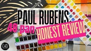
IS IT WORTH IT? Do you need the Paul Rubens NEW 48 pan YOULAN Watercolor Set? My honest opinion!
Комментарии:

Looks like a good pallet for landscapes, especially if you are mostly concentrating on the sky or it's a Fall scene
Ответить
Very interessing and Awsome Paint,
Thanks.👍👍🤩🤩💞💞

Still awake!😊
Ответить
Way too many colours for me. I don’t like those big palettes
Ответить
Are you staying in Cairo for just a season or a long while?
Ответить
Its a lovely set... on Amazon they list the colors but not the pigments. I wouldn't pay $80 without the pigment information. ❤
Ответить
Loved this really interesting and educational review, Diane.
I have enjoyed listening to you talk about the properties of each colour.
Thank you !
Very helpful 🤩💕

I love the set of larger pans of so ma ny yellows!
Ответить
Diane this quite a revealing (and exciting) way to analyze color!!! Thanks si much for your wise commentary. ❤
Ответить
Thank you. Yeah I was awake through the whole thing. Lololol ☺️.
Ответить
I have the 24 pan set and I love it
Ответить
I love the set of larger pans of so many yellows! Whyare yellows mostly transparent???
Ответить
Blueplusbrown makes black???
Ответить
I love the blue colors
Ответить
Green is so essential! Thank you for swatching all these colors! Sap green is beautiful!
Ответить
Very nice Paul Rubens! There's some colors in this palette I really like Diane ~ Awesome swatches! ❤️✝️🙏🏻
Ответить
The cost in Canada is $99.00 CDN (currently a coupon for $10.00 can be applied) that is a little beyond my budget - so I guess I better learn how to mix colours and look for the 12 colour set! 😂😂😂
Ответить
EVERYTHING is more expensive in the UK, Diane.
Ответить
Very interesting! * I really miss hearing your dogs, cockerels, and birds during your videos!
Ответить
I like that you took the time to go through each and every color because sometimes when people do a time lapse, it is hard to figure out things like the names and the pigment information. I did zoom in close to the names, but I did not see any pigment information… Most can probably be figured out based on their names, but some companies don’t always necessarily use the same pigments and sometimes use mixes and may call it something like cadmium red, for example.
Ответить
I really love you sharing your knowledge of all these colors. I learned a lot (now, if only I retain a portion of that I'll be happy 😂)!
Ответить
Often when I swatch my colors, I do not add the color name. I see now that I need to do that so that I can do a better job with mixing. I am very willy nilly when I mix and just see what turns out!
Ответить
Very interesting and I did stay awake. I enjoyed your comments on each colour. Thank you
Ответить
Hi Diane, you may be able to unscrew the metal rows and turn them around (2 of them) so they are installed correctly? I noticed the screw when you took out the burnt sienna. Hopefully it works 😊
Ответить


