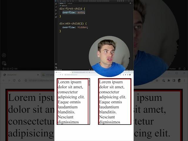
I Had No Idea This Scroll Bar CSS Property Existed
Комментарии:

I really wish I knew about this like last year. I made work arounds using JS, that took hours, to replicate this effect
Ответить
The last sentence sums it up for all css fixes
Ответить
Wow nice content
Ответить
Cool, but I can't see what happens when you add it in a mobile formfactor. You should've split the bottom of the video and animated it to show the change.
Ответить
Am I the only one who can't see the right side? It's literaly overflowing on my screen, no joke intended
Ответить
Browser support. Probably the developer's biggest issue to fix😢
Ответить
Theres a hacky workaround for this, but this is a great feature. Hope its fully supported soon
Ответить
How does this work on macOS compared to windows? The scroll bars have different widths.
Ответить
Can’t see the right side example 👎
Ответить
seems to be a rare property. Never heard of it
Ответить
Is there an equivalent for the horizontal scrollbar?
Ответить
What happens if you use scrollbar-gutter with overflow:auto? does it apply twice?
Ответить
Thank you 👍
Ответить
Am the 1,5 k like i feel so proud for no reason 😭
Ответить
chrome + firefox are the only browsers worth checking. the rest of them simply do not matter
Ответить
It makes me so mad all the stupid BS we have to deal with that should have just been a feature 10 years ago and the fact that this crap has to be opted into instead of treated as a default behavior, because people already fixed the stupid BS and will refuse to remove their stupid fixes
Ответить
Lol always safari ..
Ответить
Can you put the scroll bar on top of the page so it doesn't need to shift across? Sort of like a z-index equivalent for the scroll bar
Ответить
Thankyou brother , really informative video
Ответить
I don't see a practical use case where I would use these, besides when you do start pixel pushing (is it called like that in english? I mean when you perfectly adjust your pixels)
Ответить
I'll rather love removing it entirely 😅
Ответить
How about “overflow: overlay;”?
Ответить
The browser support might not be there but it's a noncrucial prop and is still useful whenever it works.
Ответить
Safari has left the chat
Ответить
This is much needed feature.
Ответить
as long as it is well supported by chrome and chromium based browsers, it's not that much of an issue, Safari & Firefox don't have that by default gutter !
Ответить
Классная фича. Как раз очень нужно для проекта, а я и не знал как это сделать))
Ответить
Excellent
Ответить
actually huge, guessing scrollbar sizes never again
Ответить
When you are feeling happy, remember there is always browser support
Ответить
just another rabbit hole to worry about. ship first
Ответить
wow great!
Ответить
How can you still intact the full website in this 1080x1920 resolution for yt shorts?
Ответить
good to see that css is becoming even more powerful
Ответить
Totally worthless information. No info on how to fix scrollbat\r not anchoring.
Ответить
time to center all my divs with that
Ответить
Is it there a solution that works with chrome, if I don't have the latest version?
Ответить
Very cool
Ответить
I was excited about this to solve the issue where putting overflow:hidden on the body causes the page to shift, for example when you open a modal, but this is a bad solution for that issue because then there are always 15 pixels of dead space, which is a no-no for basically all designs. for example you won't be able to do a carousel that goes all the way to the edge of the screen. :(
Ответить
i watch all your video. seems u are strong in js. Can u make course about 3D library like three.js ..?
Ответить
Not working for me could you provide the code so that I can copy & paste to see if it’s a me error or not?
Ответить
Very nice
Ответить
i love you, thanks man
Ответить
-webkit-scrollbar{ width: 0px; } - this will hide your scrollbar
Ответить
GOD!!!!
Ответить
thanks bro
Ответить
Hi Kyle please do more these learning CSS videos like this , thanks you are awesome 🎉
Ответить
browser support seems fine now minus safari
Ответить
why not just remove the scroll bar? the space looks very odd
Ответить


![[Ep. 4] Gimcheon dominated Korea's only juvenile prisonㅣZombie Trip 2 [Ep. 4] Gimcheon dominated Korea's only juvenile prisonㅣZombie Trip 2](https://rtube.cc/img/upload/VUx2aDctZmJBenk.jpg)


