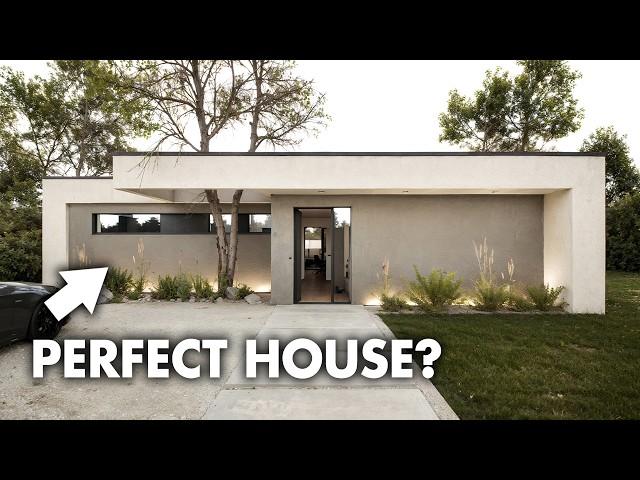
house designed for perfection | LIVING IN A SMALL MODERN HOUSE
Комментарии:

👍
Ответить
THIS DESIGN OFFERS THE BOTH OF TWO WORLDS. LUXURY AND PRAVTICALITY. THE DETAILS ARE
Wel thought out.

hola, donde consigo el plano con medidas ?
Ответить
amei boa arquitetura❤❤❤❤
Ответить
Good design. Very inspiring
Ответить
Olá, ótimo projeto, eu tenho tentado fazer a casa perfeita (não sou profissional) seguindo as regras do feng shui, tu poderia tentar? Tem algumas regras como, banheiros não podem ficar no gua da prosperidade, sucesso, relacionamento e nem saúde, cozinha não pode ficar no gua do sucesso por causa do elemento fogo e nem na frente da casa, os quartos devem ficar no fundo da casa, não podem ter áreas em falta dentro do gua, o gua se alinha com a porta de entrada, não pode ter banheiro em áreas extras, enfim é um quebra-cabeça, se puder tentar, tem essas regras e muito mais 😂
Ответить
Not bad but lately all designers/architects make living room way too small, I mean that is the main room of the house, family spends most time in, so it would make sense to make it roomier. If you add something like panoramic window with roof like in log houses or at least a little higher ceiling and level it with dining area it wouldn't take up much more space but it would appear a lot larger. At least that is how I like it ...
Ответить
Lots of trolls here, who should post their designs and renders to show us how to do it….…no house is perfect from the outset because we all have different needs and lived experiences….in many countries one full bathroom is enough, in others not….different building costs and house sizes in different countries…this is one of the best starting points I have ever seen… well done… fantastic design!
My wife’s reaction was “I love it!” And then we started to change things😂. But that is the job of the architect, something some in the comments do not understand…each design is a starting point that evolves.

I don't know, one bathroom for three bedrooms? Could get crowded. I hope there is a hidden fridge in the kitchen and a dishwasher. Also, no garage or even a carport? Could be bad for theft, vandalism or a hail storm (for the car). Nonetheless, as a basic small house it does very well. Thanks.
Ответить
Well done 👏
Ответить
I just picture a child running through the house with colored markers. 😂
Ответить
A lot of little good ideas 👍👍
A QUESTION: what is the name of this house design software?

Beauty is in the eye of the beholder.
Ответить
❤❤❤❤❤❤❤
Ответить
Stunning!
Ответить
What a stunning home!!!!!!
Ответить
Nope. This is non-functional in everyday life.
Ответить
It’s more like an ADU than the perfect house.
Ответить
way to many walls - looks chopped up and small - bordering on claustrophobic
Ответить
Flat roof is a concern depending on the region.
Ответить
Love the stunning integrated roof lines, the feature wall in living room, and the high window placements for privacy. The long narrow corridors are a bit of a miss for me, but they do give the bedroom wing some much needed privacy and separation.
Ответить
One can't live inside a pixel.
Ответить
Ich bin verzaubert und finde das Haus perfekt. Ich fühle mich sofort wohl.... traumhaft schön. Ich würde es noch minimalistischer einrichten und keine Bücher platzieren. Aber fas ist, wie alles, Geschmackssache und persönliches Empfinden. Sehr gelungen!!!
Ответить
I love it so much!!! ❤️
Ответить
Bonjour, on ne met jamais une télé(même avec dalle anti-reflets) face à une baie vitrée(surtout exposée au Sud)! On ne verra que les reflets...
Ответить
when a person sits on the couch he must only look at tv why ??????????????????????
Ответить
It’s very nice, but there are a few things I would change, so not “perfect” for me, I guess. But, certainly, good enough.
Ответить
LONG NARROW HALLWAYS MAKE IT LOOK LIKE A PRISON!
Ответить
On a sloped lot with a full basement with included car parking. I’d like it.
Ответить
Ah hell no! I won't force myself to cook in what's essentially a closet. Lot's of 'decorative' elements ...extra deep shelving as randomly-placed wall recesses but with little actual thought how people actually LIVE in a house. This design is 2/10.
Ответить
Pas de vie, pas de couleurs, tristesse.
Ответить
I have absolutely no idea what the kitchen looks like how to bathroom or bathrooms look like, have no idea why there are so many desks by the numbers of shelves with books on them. Somebody has to dust those. If I can’t see how the bedroom fit with the bathrooms or bathroom and where the washer and dryer goes this sadly is a no go for me.
Ответить
I liked the concept, but they didn't show a space for a laundry room. A house for me has to have that, too.
Ответить
Lovely house. Thank you. One small suggestion: could you put the floorplan at the start, so we have an idea of where we are in the house. In such a small house I would also have made the dining room into a combo library/dining area. But then maybe people don't have books anymore. 😂
Ответить
Efficient house, terrible video and awful staging. A desk in each of the 3 bedrooms and in the living room? Someone is obsessed with work rather than life, sadly. I was surprised there was no desk in the bathroom! And why is the kitchen window so high up? Poor cook has no view at all.
Ответить
What software did you use for rendering
Ответить
Not for New England. Flat roof, no garage, no basement, no screened porch. Good for SoCal, SWUS.
Ответить
Looking for a small one story contemporary house design, this is it! I'd change a few minor things but overall very nice.😎
Ответить
Beautiful design for a warm climate.
Ответить
🧡💛💚💙💜
Ответить
Nice. I love the design in which all rooms are connected to the central room, no secluded place. And natural greenery to all windows.
Ответить
I liked the design very much, but there are some minor changes, but the map is not clear for the room spaces and the jealousy
Ответить
It reminds me of a Frank Lloyd Wright house.
Ответить
As a single dude, this house is PERFECTION. Love the layout and simplicity. Great windows and flow. That quick view of the bathroom was stunning!
Ответить
For a family it needs another bathroom
Ответить
Never design a house where you open the front door and you see right though to the back door. Why? Apart from Feng Shui, think it out yourself.
Ответить
Love the design!
Ответить
❤ look there 😅 happy. white home . this kind of design.. I will daying .. prefect
Ответить
That is all what I need..❤❤❤❤
Ответить
"small"...
small is 60M2, 6x10


