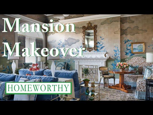
MANSION MAKEOVER | Inside a Luxurious Dallas Mansion
Комментарии:

I just started watching the first room. It is too much for me, but very exquisit fabrics I guess. But the Lady, Trish, is such a sweet Lady. She is really nervous I assume, but she is explaining everything so well and she has such beautiful eyes and smile😊
Ответить
I also watched the first room with all of the blue and so forth but it looks like a waiting room you don't put surface back to back like that it's very very lovely but it is not inviting at all I don't think I'll watch the rest of the video but I am a faithful watcher
Ответить
Enchanting... each and all Designers. Thank you Homeworthy for the tour!
Ответить
Beautiful,exquisite,very unique to the owner 👌💖
Ответить
Thanks for sharing. I love the Muse Noire space 😍😍 I need that wallpaper and the lights for my bedroom. 🖤🖤🖤🖤🖤🖤🖤🖤🖤
Ответить
Omg 😱 stunning 🤩 xx 🇳🇿
Ответить
I appreciate what each designer selected and curated for the space. I’m sure some things will be sold and/or changed if the owner deems it so.
I’ve taken a couple designer ideas for my small 1600 sq.ft home for sure.
Thank you Homeworthy!

Ahhh. What I need in a space: colors, textiles, and layers. 😍🥰
Ответить
That first room looks like a hotel sitting area! Not cozy or inviting ! This house was kind of not relatable to a regular homeowner!
Ответить
Too bad identity politics woman had to ruin it.😒
Ответить
The pagoda fireplace is amazing in the first space. And the Gracie wallpaper… be still my heart!
Ответить
i enjoyed the show, but was disappointed a commercial space was chosen and not a true private residence
Ответить
Fav, room was the folklore wallpaper murial, you just want to be in such a beautiful room.
Ответить
Swastika fire guard…hmmm
Ответить
I loved the Salon de Champagne, the children’s room with the double beds and the outdoor room. A really fun video to watch.
Ответить
What beautiful, whimsical, magical spaces! Such an escape from the ordinary. I imagine it would feel like living inside of an Anthropologie or a Storybook! ✨🪷🎪🦋✨ Loved it! (Except for Room #6. It did not fit in with the overall design of the Show house. I didn’t like anything about it and the designer’s vibe was an off-putting reflection of her design. My opinion.)
Ответить
The last room feels awkwardly designed and without purpose. What was that room? She said she wanted it to feel like a private tasting room? Two sofas facing each other with a giant glaring light installation right in the middle to burn the corneas out of your eyes. And two old movie theatre seats placed, again, awkwardly facing the wall. Is it designed to kill conversation and cause a feeling of uneasiness? Because that's what it's giving. I get the intention was to appreciate the art, but it could have been designed in a much better way to do that. I think a lot of people will have a visceral reaction to it, but maybe not the one she expected.
Ответить
Something felt off with Ms. Ross's decorated space, it didn't feel elevated like the rest of the spaces. Otherwise, great tour! Great work Homeworthy!
Ответить
Number 6 was the only design worth looking at. I wish certain ladies would explore the world, ensuring a plethora of ideas and designs are included in their portfolio. The overuse of floral and pastel wallpaper is so passé and sleep inducing. Do better interior designers, expand your point of view. Travel, explore then incorporate new perspectives in your work.
Ответить
As the only black designer in this Kips Bay showcase house, as she mentioned that she would not assimilate to the stereotypical Dallas interior design, wow. She is way out of her element and she is playing the victim and race card.
No one feels sorry for your privilege to be invited to decorate a room in Kips Bay. This will be your fault for being boycotted by the actual potential clients because you are too involved in playing the victim mentality.

The salon de Champagne is a paradis de passementerie 😉 Marvelous room, and this video is an educational experience. I would love to see it in person. Outstanding designer!
Ответить
The terrace is the only tasteful space.others way to overdone.
Ответить
I never like the decorator houses because it doesn’t flow very well. It’s a mishmash of decor styles.
Ответить
What’s the story behind the house? Does it belong to someone or do the designers take their things out after?
Ответить
Those sofas in the “salon” needs to be flipped facing each other so that no one can be gossiping about you🗣️👀 That pagoda mantle is to die for❣️🏯
Ответить
I love it when Homeworthy shows designer show houses…everyone doing their very best is when we can see things/ideas that would not be seen. IMO
Ответить
Ashley’s room was the worst. What was that room?? Tacky and why bring up that you’re black. Who cares?? Just design a nice room but that was awful.
Ответить
Too much! Overdone!
Ответить
All talented designers with unique perspectives. Something for everyone. Thanks for sharing.
Ответить
The fireplace is amazing and I wanted it in my life! Who made it again? I couldn’t understand what she said. I listen to it a couple of times. Cachet Ornamental??
Ответить


